Superstore Sales Dashboard
Data visualization project to evaluate sales performance, profit, and quantity sold throughout the year compared to the previous year, and highlight key product categories driving profit or loss.
Overview
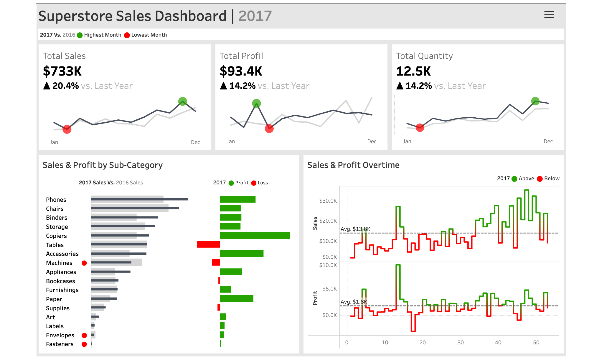
This project features a dynamic sales dashboard built with Tableau using the Superstore sample dataset. The dashboard was designed to provide a clear year-over-year performance comparison years to year, enabling business users to identify trends, monitor KPIs, and uncover sales and profit opportunities at a glance.
The key focus was on delivering actionable insights through interactive visualizations of sales, profit, and quantity, broken down by time and product sub-categories.
Challenges
- Designing a layout that balances clarity and information density for executive-level users
- Integrating year-over-year comparisons without cluttering the interface
- Highlighting top/bottom performers and sales trends for quick decision-making
Solution
To tackle these challenges, I used Tableau's visual storytelling capabilities and interactivity:
- Time Series Analysis: Line charts with markers for the highest and lowest months across KPIs (sales, profit, quantity)
- Comparative Bar Charts: Side-by-side sub-category sales for current year vs. previous year, with profit/loss color coding
- Trend Highlights: Used reference lines and color coding to show above/below average performance over time
Results
The final dashboard enables users to:
- Track key performance indicators (sales, profit, quantity) at a glance
- Identify the best- and worst-performing months and product sub-categories
- Explore profit trends and losses visually, driving strategic business discussions